
Fundamentals of Character Design for Games
Learn the core principles that make game characters memorable and functional across different art styles and game genres.
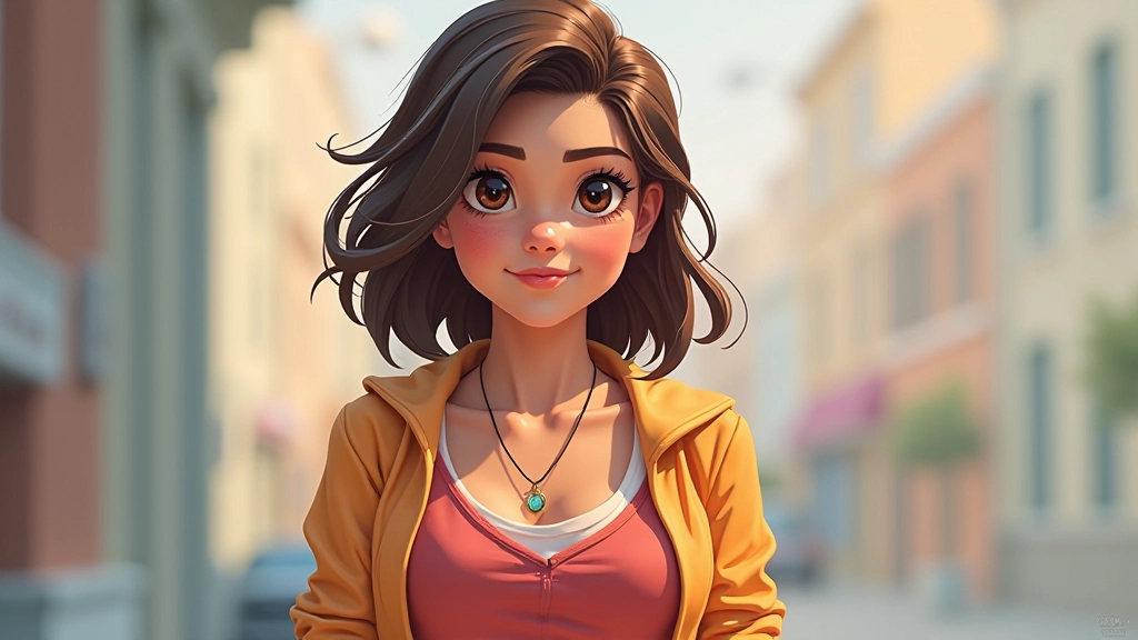
Your visual style is what makes your characters instantly recognizable. It’s the difference between a character that blends into the crowd and one that stands out in a crowded game store. When you’re developing 2D assets, stylization isn’t just decoration — it’s a strategic tool that guides the player’s eye and communicates the game’s tone in seconds.
Color theory works the same way. The right palette doesn’t just make your art look good. It tells players whether your game is cozy or dangerous, comedic or serious, familiar or alien. We’re going to break down how to build a distinctive visual voice and use color strategically to create characters that actually resonate with players.
Stylization starts with deciding what to emphasize and what to downplay. Are you exaggerating proportions? Simplifying forms? Playing with expressive linework? The best stylized characters have a clear decision behind every choice.
Look at successful games — Hollow Knight simplifies almost everything into bold shapes and clean silhouettes. Cuphead commits hard to rubber-hose animation principles. Genshin Impact uses anime conventions but pushes them further. Each one had a vision and committed to it. You don’t need to be photorealistic to be powerful. You just need to be intentional.
Start by asking: What’s the core appeal of this character? Are they meant to feel heroic, cute, menacing, or quirky? Your stylistic choices should amplify that feeling. If you’re designing a tough warrior, exaggerate the shoulders and jaw. If you’re designing a scholar, maybe emphasize the eyes and hands instead. The style isn’t decoration — it’s storytelling.


Color theory in game design isn’t about creating beautiful paintings. It’s about control. Every color you choose should do work — either it communicates character, directs attention, or creates contrast that makes the character readable at small sizes.
Start with a dominant color. This is your character’s primary hue — what the player sees first and remembers most. Make it distinctive. If you’re making a fantasy RPG, you don’t want your main character wearing the same muted grays as everyone else. Then add a secondary color that contrasts with your dominant. Don’t use colors that sit next to each other on the color wheel unless you want harmony. Instead, reach across — if your character wears blue, add orange accents. They’ll pop.
The third color is your accent — the one you use sparingly. A tiny spot of yellow on a blue character makes the eyes read instantly. A dash of red on a green outfit creates visual excitement. You’re not trying to use every color. You’re creating a system where each color has a purpose and reinforces the character’s identity.
This article provides educational information about 2D art techniques and color theory principles used in game development. These are foundational concepts and best practices observed across the industry. Individual results will vary based on your specific project, game engine, and artistic vision. Consider these guidelines as starting points for experimentation rather than absolute rules — the most successful artists break conventions thoughtfully and intentionally.
Here’s the reality: your beautiful character might appear at 64 pixels tall on someone’s phone screen. All that subtle shading and delicate detail? Gone. This is why stylization matters practically, not just aesthetically. Bold shapes, clear silhouettes, and high contrast become essential.
Test your character at multiple scales. Scale it down to thumbnail size. Does the character still read as distinct? Can you tell them apart from similar characters? If not, you need stronger shapes or higher contrast between the character and background. This is why flat-design games often work so well — they’re forced to communicate through shape and color because there’s nowhere to hide.
Value contrast is your best friend here. The relationship between light and dark areas matters more than hue. A character with a 50% gray silhouette against a 50% gray background is invisible, no matter how beautiful the colors. Push your values — make dark areas really dark and light areas really light, especially where you need visual clarity.


When you’re building a roster of characters, they need to feel like they belong together while remaining visually distinct. This is where systematic thinking about color and style becomes critical. You’re not just making one good character — you’re creating a cohesive cast.
Establish rules for your world. Maybe all characters in your fantasy game use earth tones for clothing but have varied skin tones and hair colors. Maybe your sci-fi game limits the color palette to cool tones with neon accents. These constraints actually make design easier and more cohesive. When everyone’s wearing different colors, no one stands out. When everyone’s working within a shared system, individual choices become more powerful.
Your stylistic approach should be consistent too. If one character is hyper-realistic and another is cartoonish, they don’t feel like they belong in the same game. That doesn’t mean everyone needs identical proportions — it means your approach to simplification or exaggeration should be intentional and consistent. Commit to your decisions and players will feel the craft.
Stylization and color theory aren’t academic exercises — they’re the difference between a character that players immediately connect with and one they forget. When you combine a clear stylistic voice with strategic color choices, you create assets that work across all screen sizes, all lighting conditions, and all contexts.
Start by choosing what to emphasize. Build a palette with intention and contrast. Test ruthlessly at different scales. Then create a system that lets you build a cohesive cast without losing individuality. That’s how you create 2D characters that actually resonate. You’re not just making art — you’re communicating, guiding attention, and building a world that feels intentional.